With Ion Fury coming out on PS4 tomorrow, we wanted to give everyone a peek behind the scenes by diving into one of the game’s most important features, its unique level design philosophy!
Every Build Engine game has a Level Design philosophy and a set of rules. One of the most important ones is this: “Always start with a BANG!”
A key aspect of every Build Engine game was their memorable introduction to the first level.
Duke Nukem 3D: Ejected from a flaming ship on the rooftop of a building.
Blood: Caleb resurrecting from the dead coming out of a grave hungry for revenge.
Shadow Warrior: Start in a dojo and a zombie ninja jumps inside from the window, allowing you to slice him in half with your katana.
Ion Fury is no exception to this rule, so we had to start the game in a memorable way, which set the tone and showed the players that this was no walk in the park!
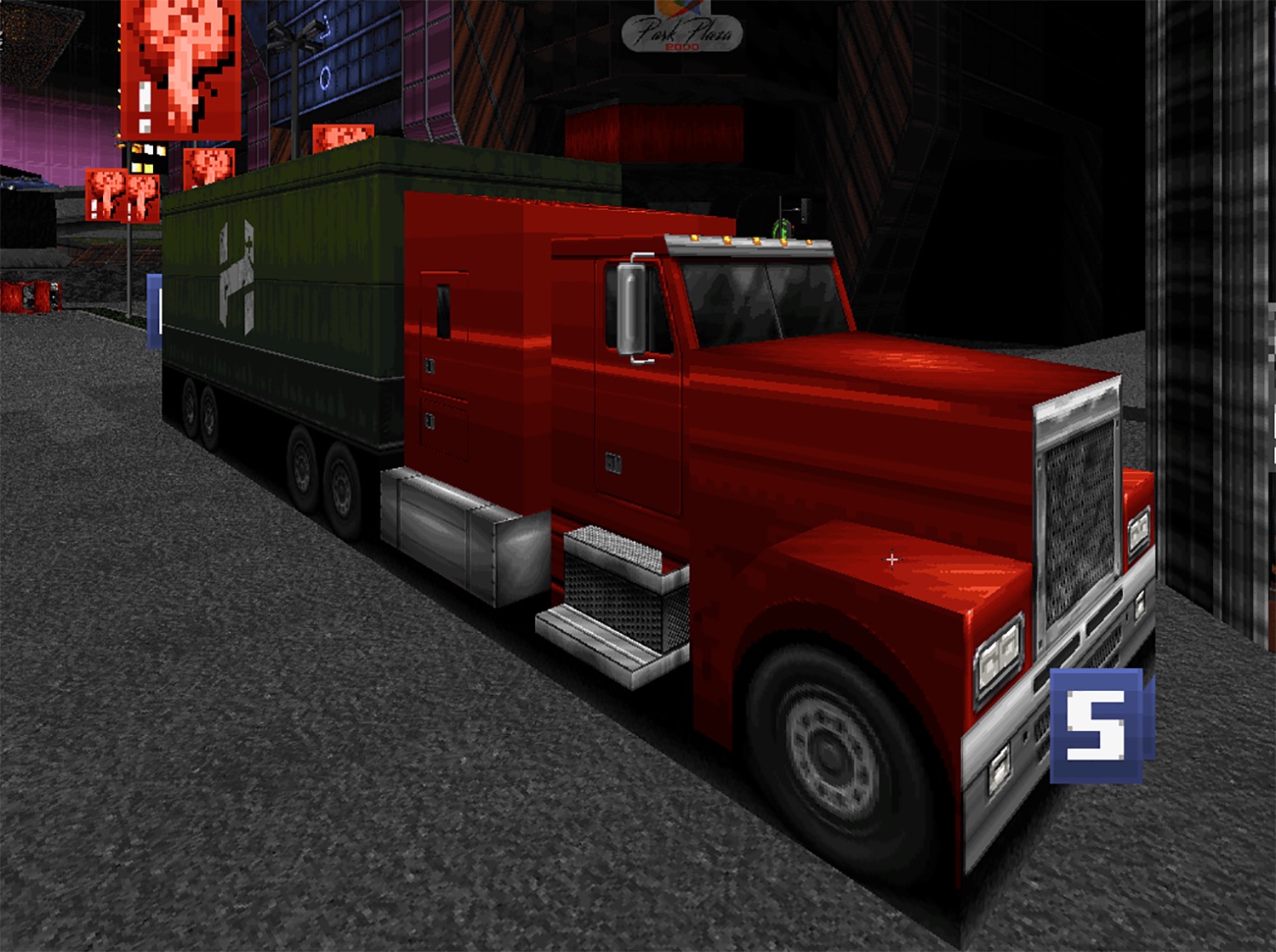
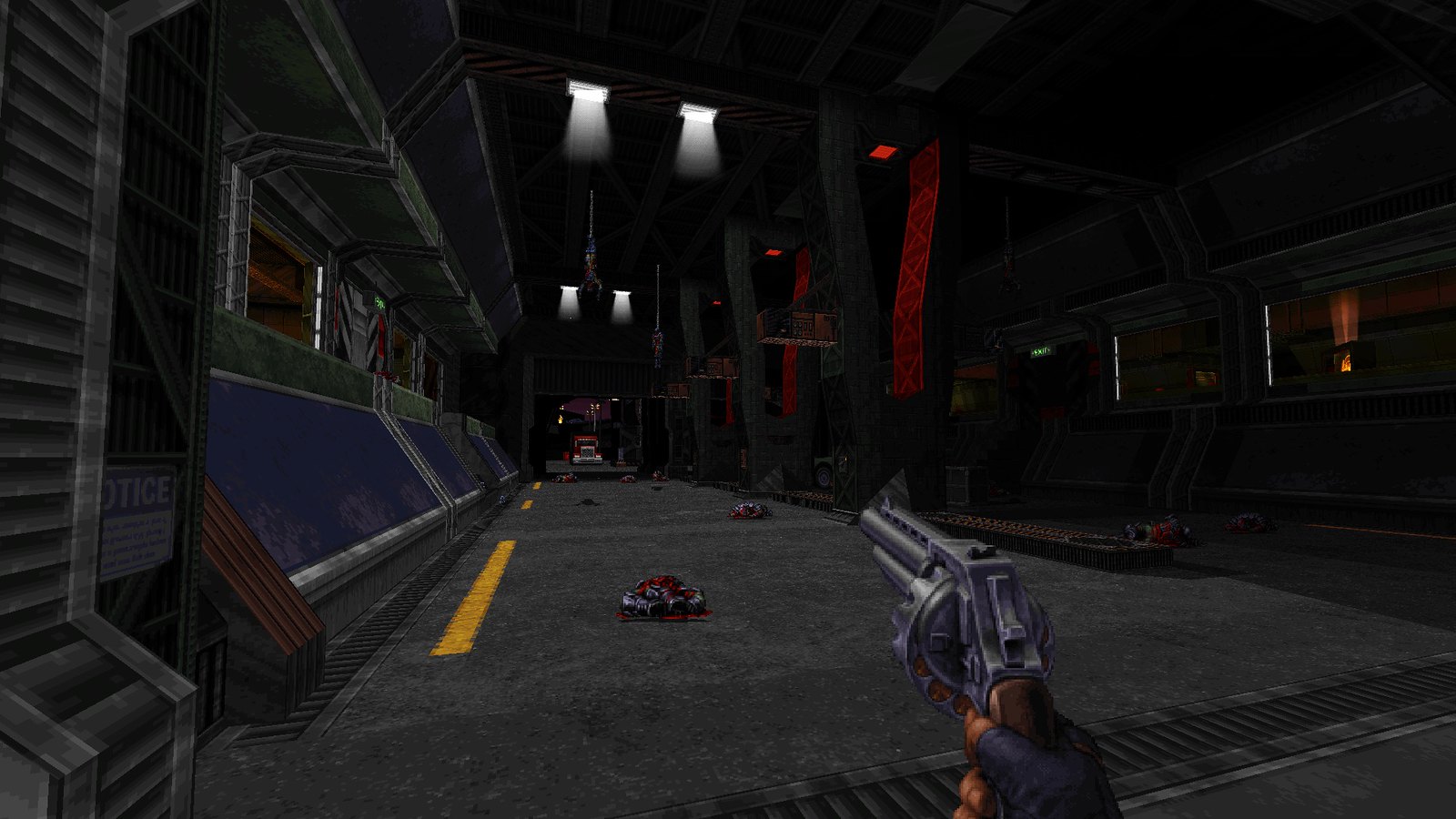
Let’s analyze Ion Fury’s Preview Campaign introduction: Heskel cultists crash a truck at full speed onto the GDF entry point.
The GDF Garage was the first level of our preview campaign (Demo of sorts). Now the game starts somewhere else but this particular scene is still featured at some point in Ion Fury.
Level Design Process
The Basic Concept
First of all you must have a basic idea of what your locations are going to be.
This can come from the story itself or the story can later revolve around the levels you made. In our case we had a basic guideline regarding the story and we built a plan with it in mind. Once we knew which locations our game was going to feature, we assigned each location to a different level designer.
Build games were well known for their level continuity by usually showing a sneak peek of the next level and practicing longer stretches of continuous flow.
We wanted to pay a bit of tribute to this and go beyond. Ion Fury would be a single campaign that would seamlessly flow from one level to another with only a brief intermission between every major chapter.
Truck crash sequence
Going back to our truck crash sequence example, this is how it was done.
1. Sketch and the Blockout
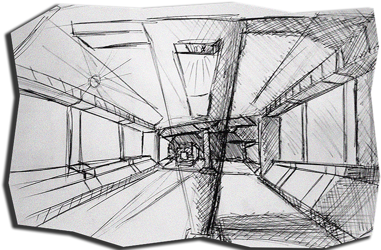
Early sketch by level designer.
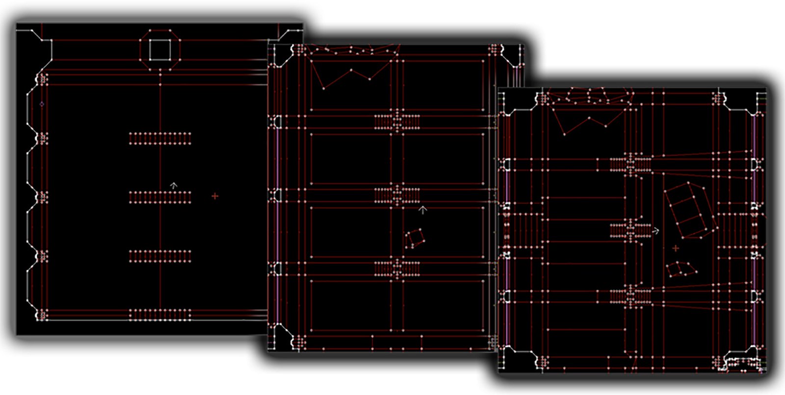
First, we started out with some basic shapes to have a sense of scale, might even throw in some lighting as well to make out the different forms. Even when doing a basic room it’s important to look at the aesthetic part of it as well, making the room visually pleasant from every angle if possible. This is probably the best moment to plan out which strategies the level will have (most of the time plans change during production). In this case, we know we want the truck to come from the streets outside, going directly at the player, so the starting spawn point must face the entry directly.
It’s best to try different shapes and ideas. Always in big blocks, avoiding too much detail at this stage.
2. Defining geometrical shapes
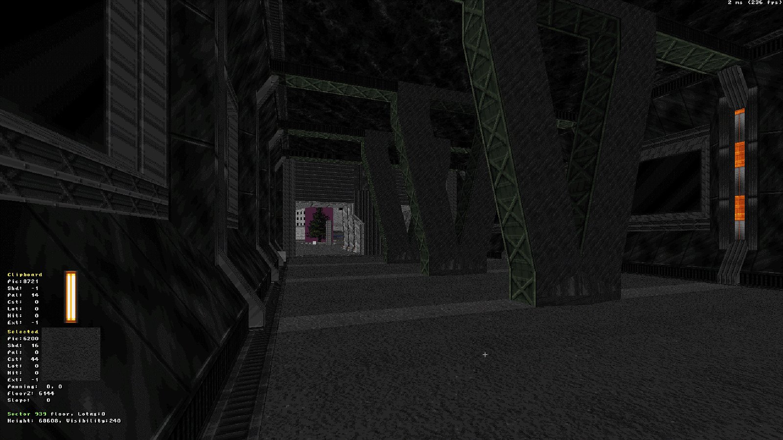
At this point we want most of the level geometry and textures in their almost-final form. Making sure textures are properly aligned next to another, doors have their proper frames, columns are the right size, etc. In this shot, we can see some light and decorative sprites have been added to get a better sense of what the final look is going to be. Rooms on the side behind the glass are still just placeholders, but looking at the fire sprites we know that at some point we want these rooms to be in a destroyed state.
Once the basic blockout is complete, it’s time to improve geometry and align texture work.
Rooms behind the windows are done repeating steps 1 and 2.
The truck was built into the game by Fox Martins, our expert cars builder.
3. Light Work
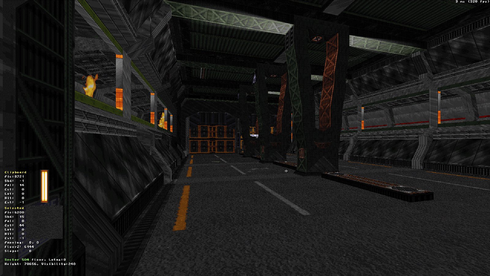
We now proceed to add the final touches to the level’s lighting work, shading every wall one by one to get a sense of “realism” with it. At this point it’s good to mix up different sets of colors to make it both visually pleasant but at the same time recognizable among other locations. It’s important for every level to have a distinctive landmark.
GDF garage is now finished aesthetically and ready for the destruction sequence.
4. Detailing and bringing the world to life
When everything just “works,” it’s time to make the place feel alive. In our case we used a variety of options like the following:
- Flickering Neon lights
- Rain, thunder, and lightning.
- Smoke coming out of vents, grates, pipes, etc.
- Particles help when trying to show broken machinery with sparks, splashes when stepping in water, of course blood coming out of our enemies entrails, etc.
- Having interactive objects is a must. arcade machines, flushing toilets, jukeboxes, etc.
- Adding ambient and interaction sounds where they belong in different locations is important in making a level in Ion Fury feel alive.
Finished scene from another level of Ion Fury. Neon lights, water drips, steam coming out of vents, flickering signs, etc. are some of the means to bring this world to life.
5. Creating the crash sequence
This is where most of the new additions and enhancements to the build engine come into play. With a new set of effects it’s possible to create almost anything in the world of Ion Fury. These effects were co-created between Jonathan “Mblackwell” Strander and Max “Oasiz” Ylitalo for the use of every level designer involved.
The truck crash sequence goes as follows:
- Player steps into the garage and the GDF main gate is destroyed by a kamikaze truck coming at full speed.
- The emergency system of the base is activated, closing the inner steel doors and window curtains.
- Truck then crashes onto the closed steel doors and still deals quite a lot of damage to the entrance and surroundings.
- Lights go out momentarily, alarm starts to sound, emergency generator is activated, lighting up the place again. Window curtains are lifted.
- The bent steel door is visible, destroyed rooms are now ablaze.
- Doors on the sides open up and enemies enter; time to kill some invading cyborgs.
And this is only one of many cool sequences you are going to find in Ion Fury.
We hope you liked this blog entry made to give you a little bit of insight into the design process of our game, Ion Fury, available tomorrow on PS4. Until next time!
Website: LINK

