Today, Cuphead’s free update is available on Xbox One and features a variety of new features, art, and other changes making Cuphead ready for the adventures ahead – including adding Mugman as a playable character in single-player, complete with his own level completion jingle. One of the more unique things about this update is the massive amount of work Studio MDHR put in to localize Cuphead for a global audience. We caught up with Co-Director at Studio MDHR Chad Moldenhauer to talk about this work, Cuphead’s art and creative direction, and the surprising success of their game a year later.
Xbox Wire: It has been a year since the launch of Cuphead on Xbox One and today its being updated to support a variety of international languages. What made you decide to return to this game and, not only improve it with new animations, but to give it a personal appeal to all these other languages?
Chad Moldenhauer: From the outset, we knew that we always wanted to support Cuphead with a variety of languages, and our intention was actually to ship the game with localization. When we really dug into what would be required to make each translation feel authentic, however, we quickly realized that it was a far bigger task than we had time for in the lead-up to launch.
Given all the love & care we had put into the English version of the game – complete with video game references, animation call backs and lots of character – we felt strongly that all the game’s languages deserved the same level of polish. So ultimately, we made the tough decision not to release with multi-language support, and instead seek out an amazing team of translators who could do each of the game’s 11 new languages justice. We’re really happy with where things ended up!
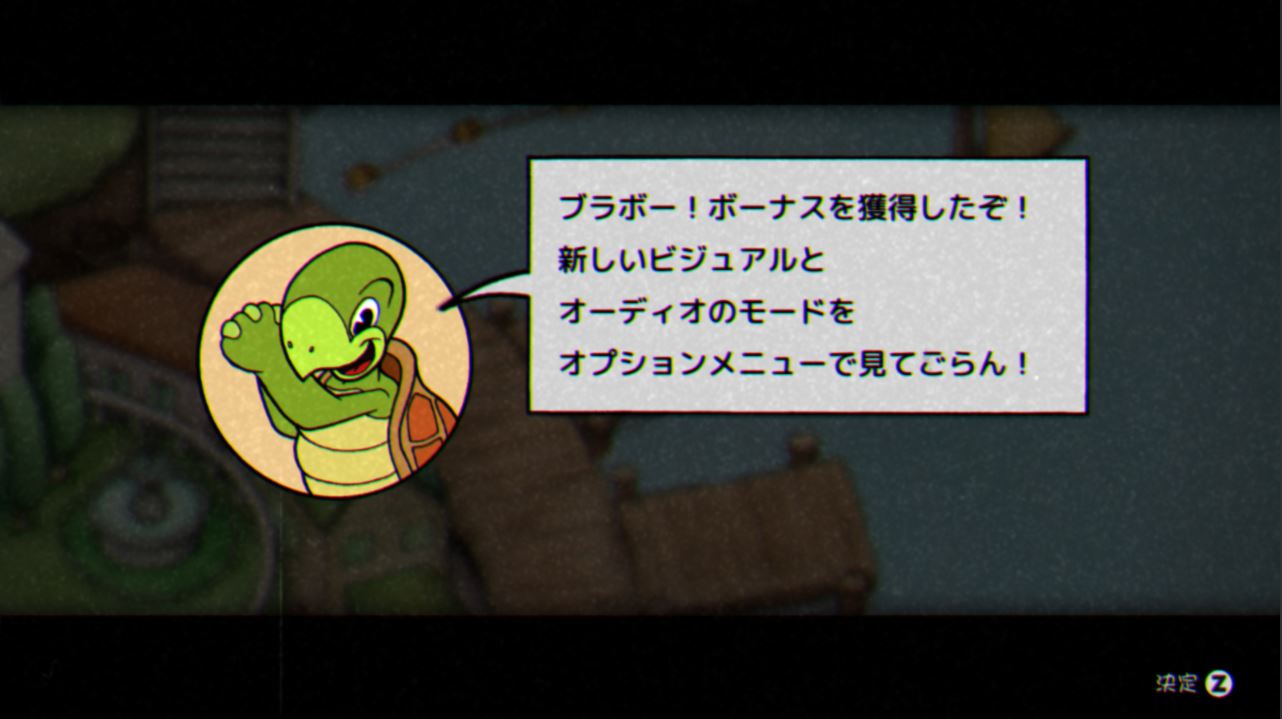

As for the new visual flourishes, the ability to play as Mugman, and the animated cutscenes, these were stretch goal items from the wish list we had been building internally during development. Like so many developers, we ended up shelving these things as the game go closer to completion, but in our heart of hearts we always knew we’d return to them – the game just didn’t feel complete to us without them!
XW: What was one of those most challenging design elements you encountered in creating this massive update to Cuphead?
Moldenhauer: Many of the biggest design challenges with this update were visual! As we laid out the various translations in-game, it became apparent that each language had varying lengths and sizes for everything from boss titles to NPC dialogue.
Because so much of Cuphead is done by hand, we had to do an extensive pass of each language, going over the game with a fine tooth comb to make sure each lines of text weren’t running over in places like our storybook cutscenes. It was a meticulous process!
In addition, the addition of new animations, new languages, and hand calligraphy offered us the chance to re-evaluate the way were packaging our assets, and make some engineering optimizations so that this update wasn’t slowing the game down. In fact, we were able to greatly improve loading times on Xbox One, which we’re really excited about!
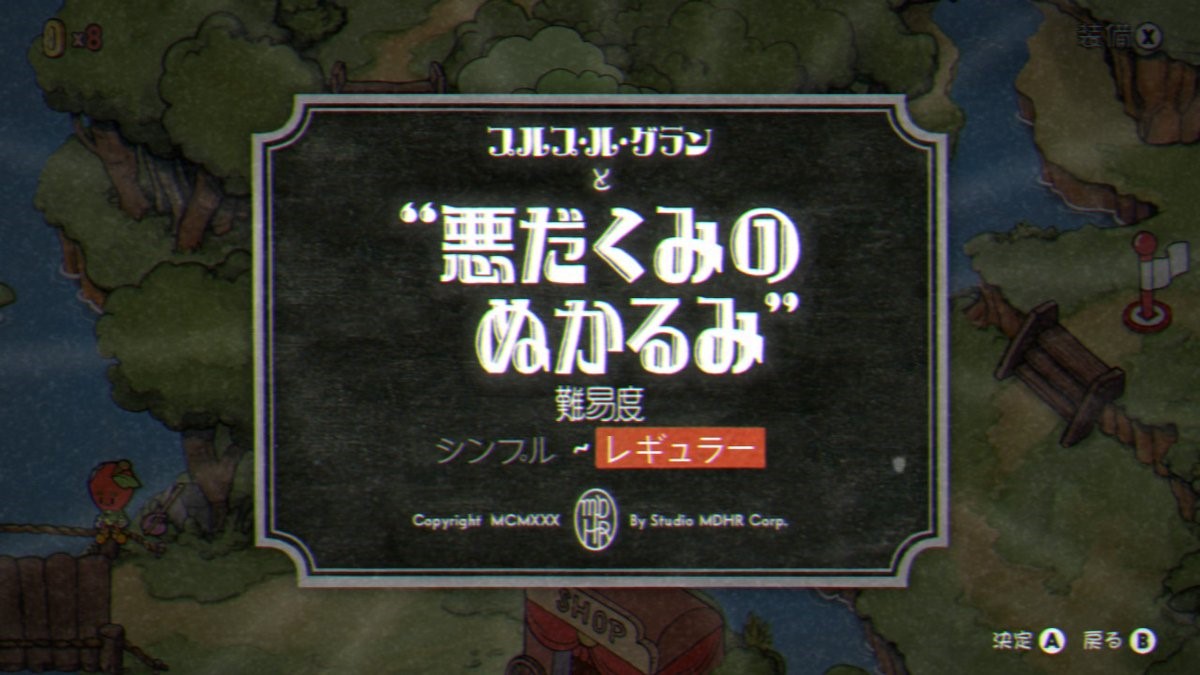

XW: Gamers who played the game since launch have seen the influence of older American cartoon styles establish the unique look of the game and its characters, but with this update the new localized version of the games includes typefaces influenced by Japanese, Korean, and Chinese cartoons. Which cartoons influenced this design for these regions?
Moldenhauer: Interestingly, there was a mixture of references we made to cartoons of the era in these regions as well as physical media like posters, type faces, and even books! We sifted through everything from Hanafadu Card packages to tourism posters of the era as points of reference for our calligraphers. While not our one touchstone, a whimsical Japanese cartoon that does stick out in my mind from our research is Ugokie kori no tatehiki, a whimsical Tom-and-Jerry-style slapstick retelling of the classic “boy who cried wolf” parable from 1930s Japan.
XW: What was it like working with expert calligraphers to help bring the boss and level design lettering to life in way that will meet fan expectations? Could you share details on that process?
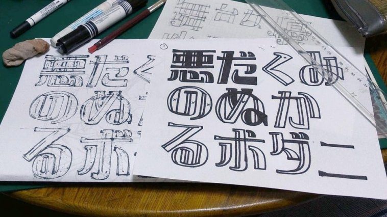
Moldenhauer: It was a total joy to work with our two calligraphers, Keisuke Chiba (who did our Korean and Japanese calligraphy) and Shiyuan “Sheera” He (who did the Chinese hand-lettering). Having no experience with the hand-drawing techniques of other languages, it was a real learning experience to see them bring the game’s Asian-language hand lettering to life.
The process was very collaborative, and usually kicked off with us sending over a series of references so that we could find the overall lettering style – one with the right thickness, line weight, personality, and homage to the era. After settling together on a style for each language, we left a lot of the creative decisions up to the calligraphers, while providing input on layout and spacing to keep things looking consistent in-game.
After spending so long during Cuphead’s creation working with master hand-letterer Warren Clark, it was a lot of fun to let these two other amazing artists play in this space!


XW: During your research into creating this update, were there any characters or artistic styles that you discovered for the first time that particularly stuck out to you?
Moldenhauer: I hope it doesn’t sound like a catch-all answer to say that almost everything in the hand-drawing styles of other languages was new to us, because that’s really the case! We were very focused on paying homage to a specific style and era of American animation with Cuphead, so working on calligraphy in languages like Japanese opened our eyes to a whole other facet of art and animation that we’ve come to appreciate.
XW: Beyond the Asian language features being included into Cuphead, you’re also working on French, Italian, German, Russian, and more. Will these language versions see influences from their old cartoon formats in their localized versions too?
Moldenhauer: Something we’re proud of with this translation is the way that the linguists for each language made efforts to go beyond pure “localization” and try to really “culturalize” each translation. Each translator was really picky about taking the English meanings of our titles, phrases, and dialogue and researching to craft an interpretation that made sense and felt on-era for that language – referencing ideas and concepts that would resonate with each audience rather than simply interpret the original translation literally.
It’s also worth mentioning that when creating Cuphead, we really tried to steep ourselves in the 1930s media landscape beyond cartoons, d drawing from posters, films, books, graphic design principles, trading cards, almanacs – you name it!


XW: Do you have a message for the gamers in the countries that you’d like to share now that they get to experience Cuphead in their native language?
Moldenhauer: Nostalgia was something we tried to evoke very strongly with Cuphead – whether for classic arcade-action games of the 80s and 90s, hand-animated 2D cartoons, or vibrant orchestral music. Our hope is that the work we’ve put into these localizations allows more people than ever before to experience this nostalgia.
And for those who may have been waiting until the game was available in their language before jumping in, we can’t thank you enough for your patience as we pushed to get things just right, and hope you have a joyful time adventuring across the Inkwell Isles.
Thank you, Chad for taking the time to talk with us here on Xbox Wire about Cuphead and its newest content update. For all the latest news about Cuphead and more of your favorite Xbox One games, keep it tuned here to Xbox Wire.
See the rest of the story on Xbox Wire
Related:
Next Week on Xbox: New Games for April 23 to 26
Grip Gets Updated with Four New Tracks and One New Team Mode
The Sims 4 Spa Day is Now Available, Plus Mouse and Keyboard Support on Xbox One

Website: LINK

